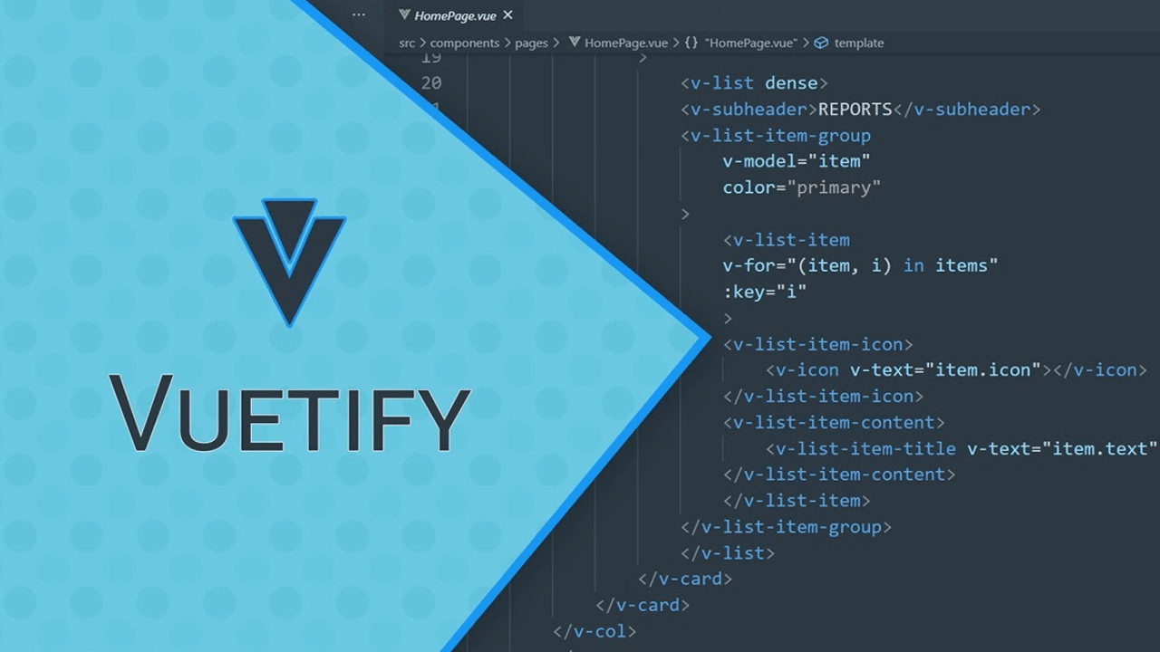
In today’s fast-paced digital world, crafting responsive, visually appealing user interfaces is essential for developers. Vuetify, a Vue.js component framework based on Google’s Material Design, offers a seamless way to build beautiful and functional web applications. This blog introduces you to Vuetify’s core components—buttons, grids, and typography—and demonstrates how to create a responsive homepage layout that adheres to modern UI standards.
Understanding Vuetify’s Material Design Philosophy
Material Design, created by Google, promotes a consistent and intuitive user experience across devices. Vuetify embraces this philosophy, equipping developers with a robust toolkit to build applications that are both aesthetically pleasing and user-friendly. Its prebuilt components save time while maintaining design consistency, making it a preferred choice for developers.
Getting Started with Vuetify Components
Let’s delve into the core components of Vuetify and learn how they can simplify your development process.
Buttons: The Core Interaction Element
Buttons are a key element in user interfaces as they allow users to take actions. Vuetify provides multiple styles and configurations for buttons, enabling customization to suit any use case.
<v-btn color="primary" @click="handleClick">Primary Button</v-btn>
<v-btn outlined color="secondary">Outlined Button</v-btn>
<v-btn icon>
  <v-icon>mdi-home</v-icon>
</v-btn>
Explanation:
<v-btn color="primary">: Creates a button with the primary theme color. This is useful for actions like “Submit” or “Save.”outlined: Adds a border around the button without filling it with color, giving it a minimalist appearance.<v-btn icon>: A compact button displaying an icon (like a house). Perfect for navigation buttons or adding a subtle action point.
When designing with Vuetify, buttons can also trigger specific functions. For example, clicking the primary button above could log a message, navigate to another page, or perform other tasks depending on the @click handler.
Grids: Structuring Your Layout
The grid system in Vuetify uses Flexbox principles to create responsive designs. It adjusts the layout automatically based on the screen size.
<v-container>
  <v-row>
    <v-col cols="12" sm="6" md="4">
      <v-card class="pa-3">
        <v-card-title>Card 1</v-card-title>
        <v-card-text>This is a sample card.</v-card-text>
      </v-card>
    </v-col>
    <v-col cols="12" sm="6" md="4">
      <v-card class="pa-3">
        <v-card-title>Card 2</v-card-title>
        <v-card-text>This is another sample card.</v-card-text>
      </v-card>
    </v-col>
  </v-row>
</v-container>
Explanation:
<v-container>: The outermost container, acting as a wrapper for the grid system.<v-row>: Defines a horizontal row that can contain multiple columns.<v-col>: Represents individual columns, which dynamically adjust their width. For instance,cols="12"ensures the column takes the full width on small screens, whilemd="4"sets it to one-third width on medium screens.
This structure ensures that the layout remains responsive, adapting seamlessly to devices of varying screen sizes.
Typography: Crafting the Visual Hierarchy
Typography defines the appearance and readability of text, ensuring that content is legible and appealing.
<v-container>
  <v-row>
    <v-col>
      <v-typography variant="h1" class="mb-3">Welcome to Vuetify</v-typography>
      <v-typography variant="body-1">Vuetify provides a comprehensive set of typography classes to enhance readability.</v-typography>
    </v-col>
  </v-row>
</v-container>
Explanation:
variant="h1": Sets the text as a headline. Use this for main titles or headings.variant="body-1": Displays the text in a smaller, body-text style, suitable for detailed descriptions.class="mb-3": Adds a margin below the text, creating space between elements.
Vuetify’s typography system ensures visual consistency, making your application look professional.
Building a Responsive Homepage Layout
Using the components above, let’s create a simple homepage layout.
<template>
  <v-container>
    <v-row>
      <v-col>
        <v-typography variant="h1">Vuetify Homepage</v-typography>
        <v-btn color="primary" @click="handleAction">Get Started</v-btn>
      </v-col>
    </v-row>
    <v-row>
      <v-col cols="12" md="6">
        <v-card>
          <v-card-title>Feature 1</v-card-title>
          <v-card-text>Explanation of feature 1.</v-card-text>
        </v-card>
      </v-col>
      <v-col cols="12" md="6">
        <v-card>
          <v-card-title>Feature 2</v-card-title>
          <v-card-text>Explanation of feature 2.</v-card-text>
        </v-card>
      </v-col>
    </v-row>
  </v-container>
</template>
Explanation:
- The header introduces the homepage with a title and a call-to-action button.
- Feature sections highlight two key functionalities or services of the application.
- The responsive design ensures that the cards stack on smaller screens but display side by side on medium to large screens.
Conclusion
Vuetify simplifies the process of creating visually appealing and responsive web applications by leveraging Material Design principles. By mastering its components—buttons, grids, and typography—you can build robust layouts that deliver excellent user experiences. Start exploring Vuetify today to transform your web development projects into seamless and professional applications!

